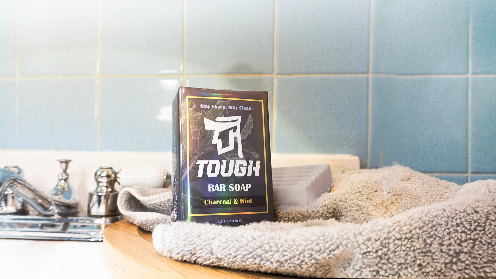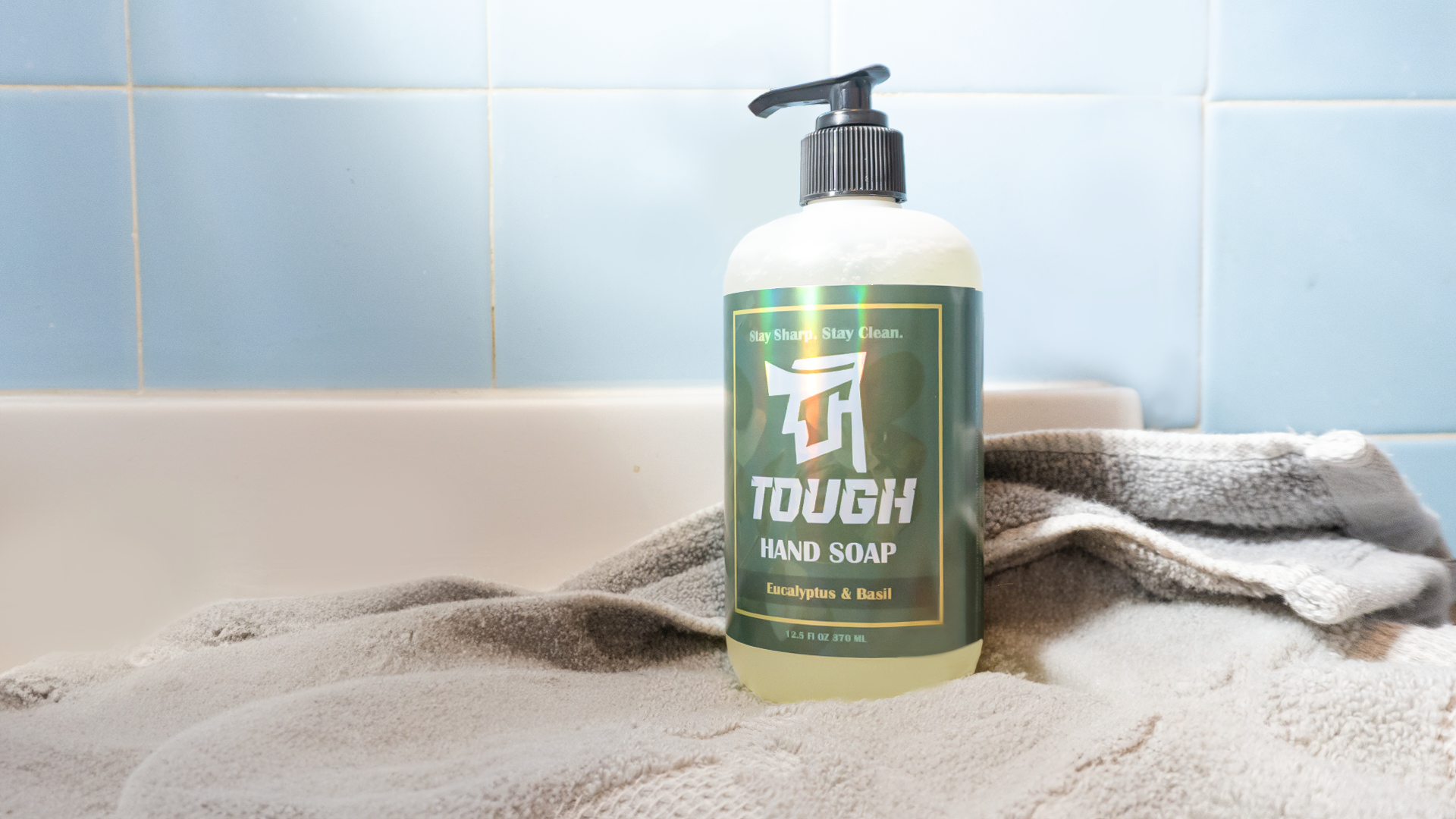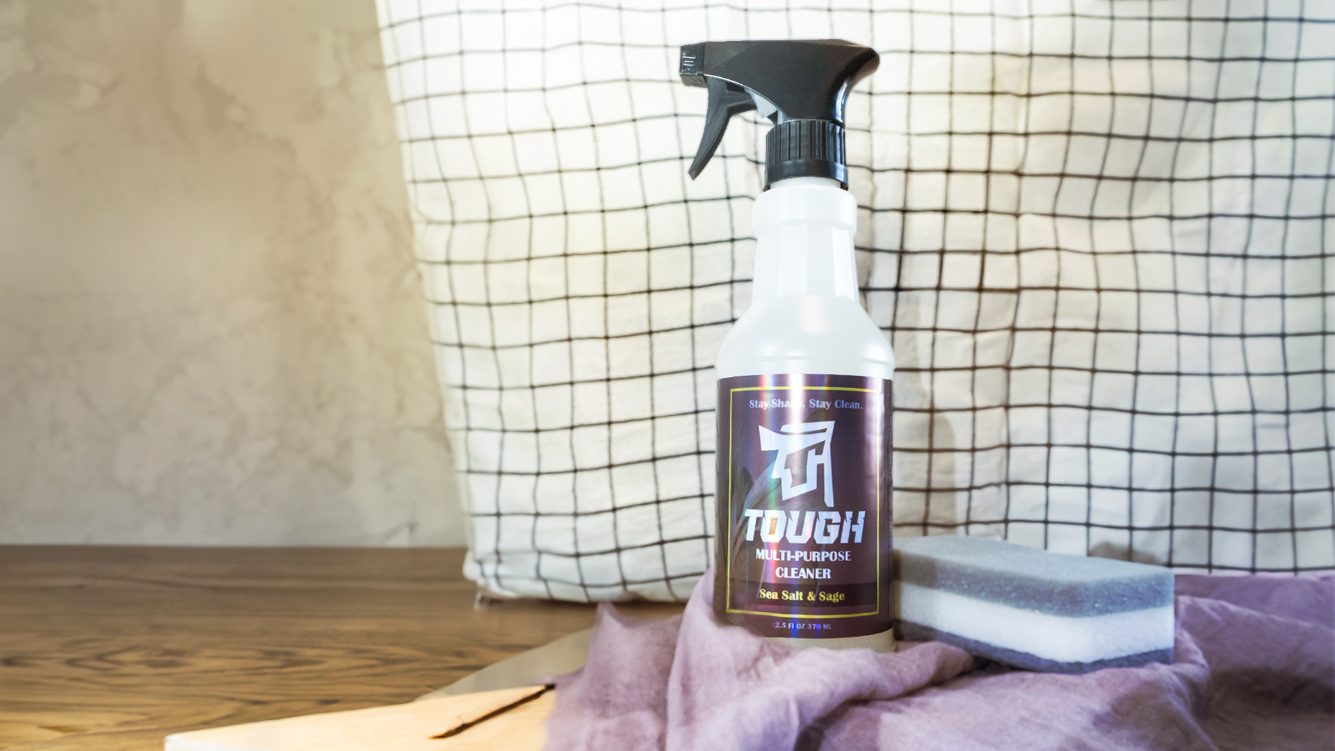
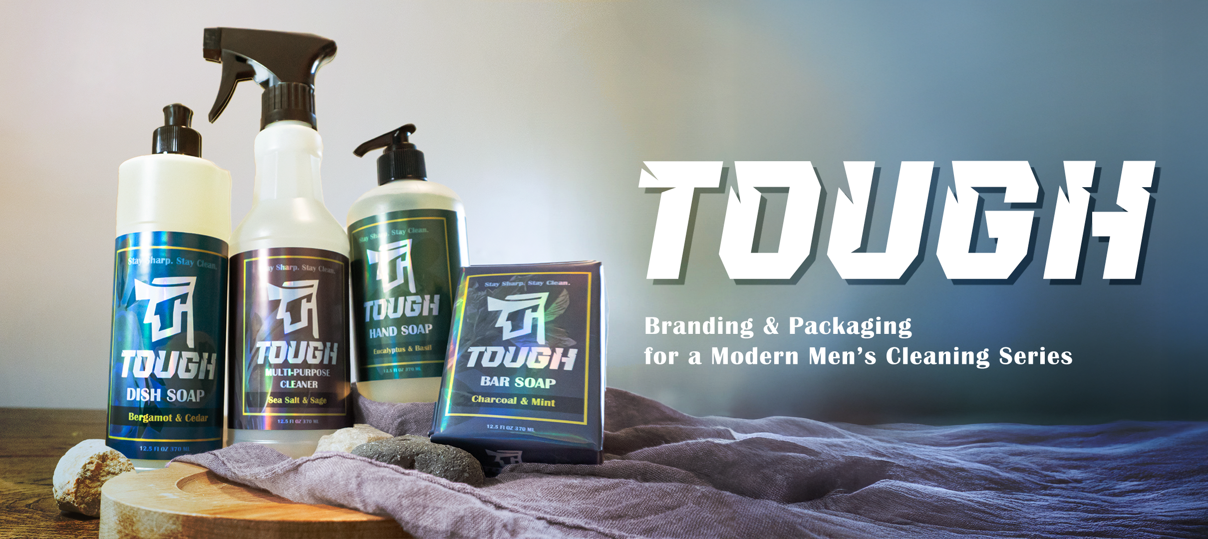
TOUGH is a cleaning brand for modern men who see care and cleanliness as a sign of strength. This project explores masculinity through simplicity, natural ingredients, and bold design, demonstrating that being “tough” encompasses living with intention
and refinement.

LOGO DEVELOPMENT
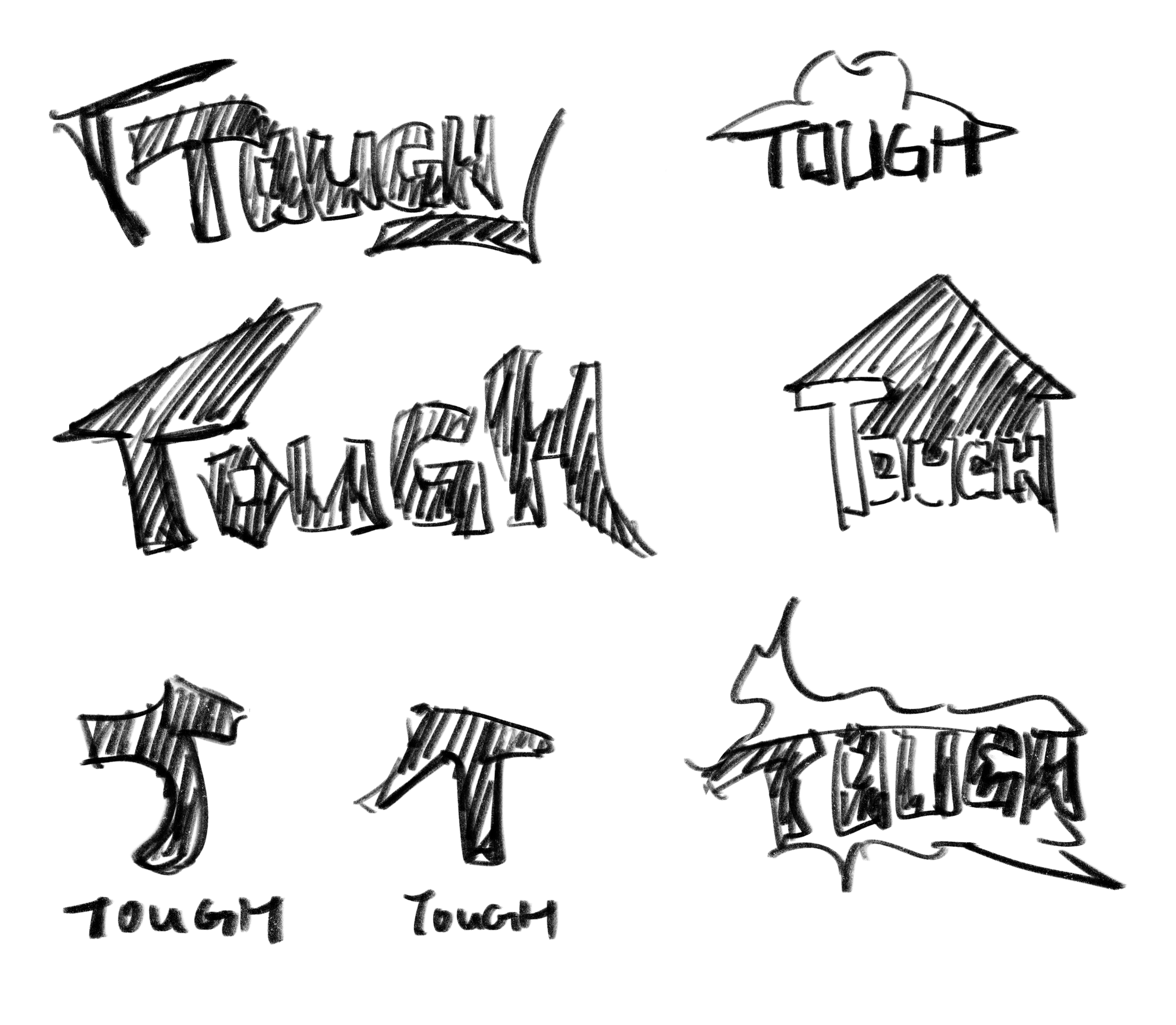
Initial Sketches
Exploring different visual directions for the TOUGH identity.
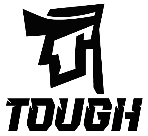
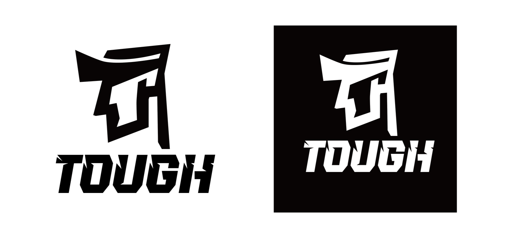
Final Logo
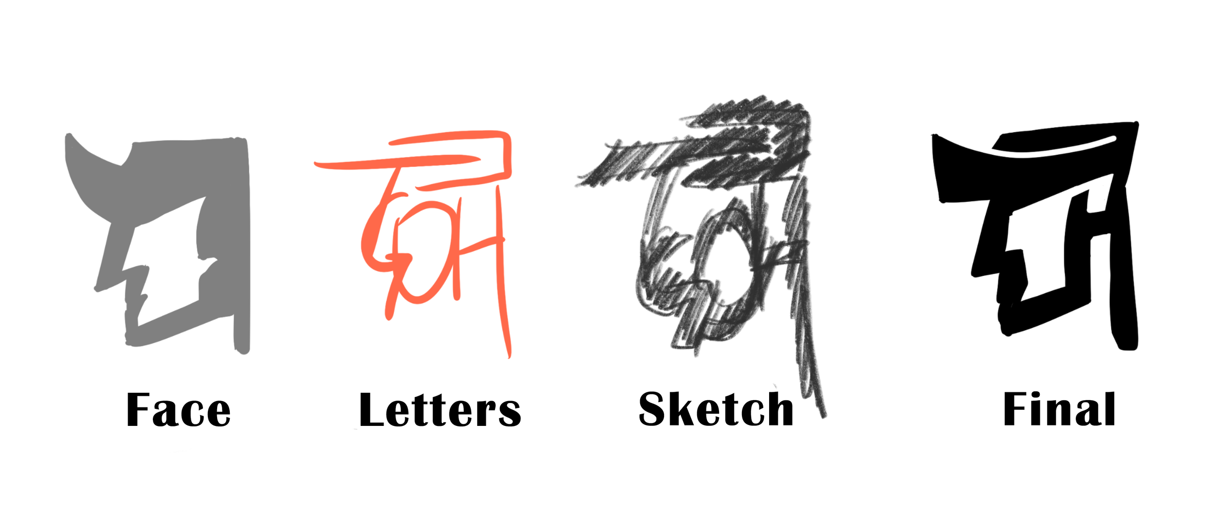
Logo Evolution
Developing the final mark by combining facial features with the letterforms of “TOUGH.”
I began by sketching different ideas for the TOUGH logo, exploring bold letterforms, shapes, and symbols. After choosing a face-inspired direction, I experimented with incorporating the letters from “TOUGH” into the facial structure, gradually simplifying and combining the forms into the final logo mark.

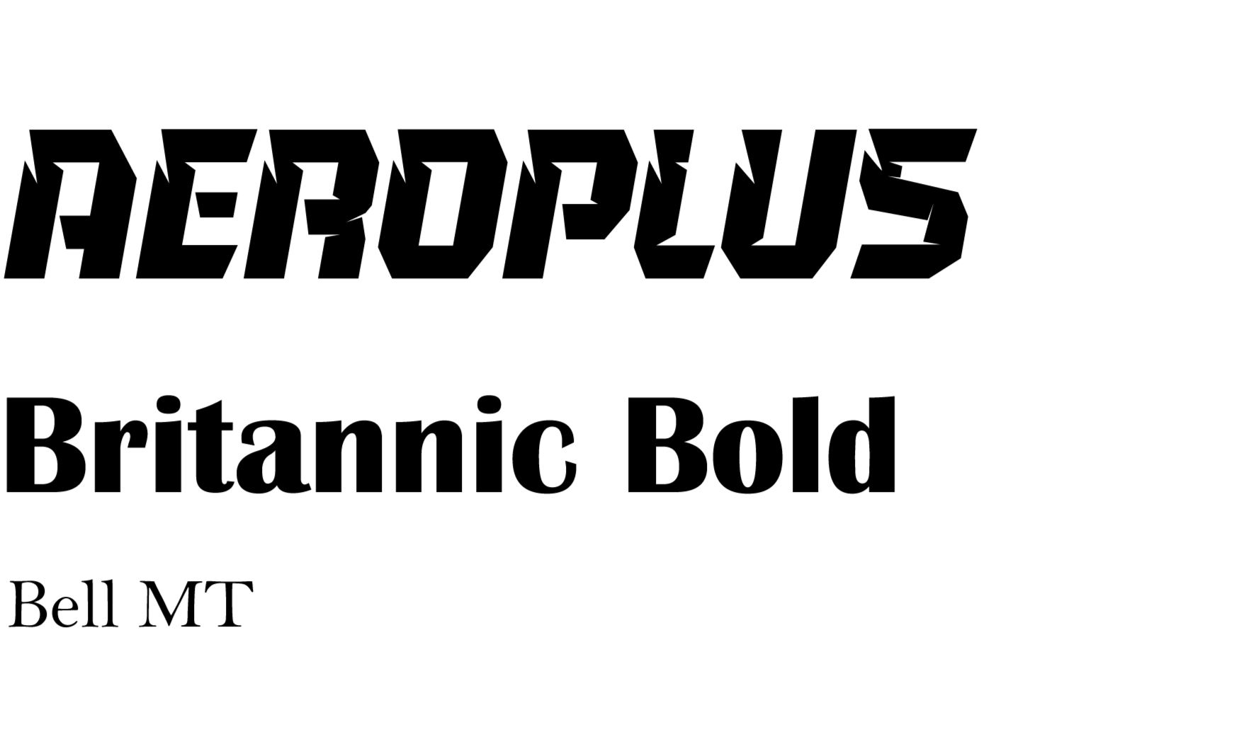
FONT
TARGET AUDIENCE
Men, ages 18–35
Value both function and aesthetics
Prefer clean, bold, and modern design
Take pride in maintaining their space
Interested in natural scents and thoughtfully designed products